
An email capture landing page is expressly created to prompt the visitor to enter an email address. Sites that create email capture landing pages want to build their email distribution channel as a way to talk more directly to their customers.
Think of it as a transaction. Your landing page showcases a specific offer — something the visitor deems valuable — (usually) for free in exchange for an email address. Lead-generation landing pages include a form or quickly serve one to visitors when they click-through to indicate they’re interested. In the examples that follow, you discover useful email capture strategies and see how they’re applied on landing pages.
Build Landing Pages Easily with Taboola's Landing Page Quickstart Guide
Get Started
Build Landing Pages Easily with Taboola's Landing Page Quickstart Guide
Get Started10 Examples of Effective Email Capture Landing Pages
The following landing pages include standout features that make them particularly effective, whether the goal is to sell a product, become a voice of authority, segment readers into various groups, or invite them to an event. (Keep in mind that landing pages are likely to change over time and may not be up to date; we’re featuring them because of their standout use of email capture strategies.)
1. Close: Showcases the Main Offer
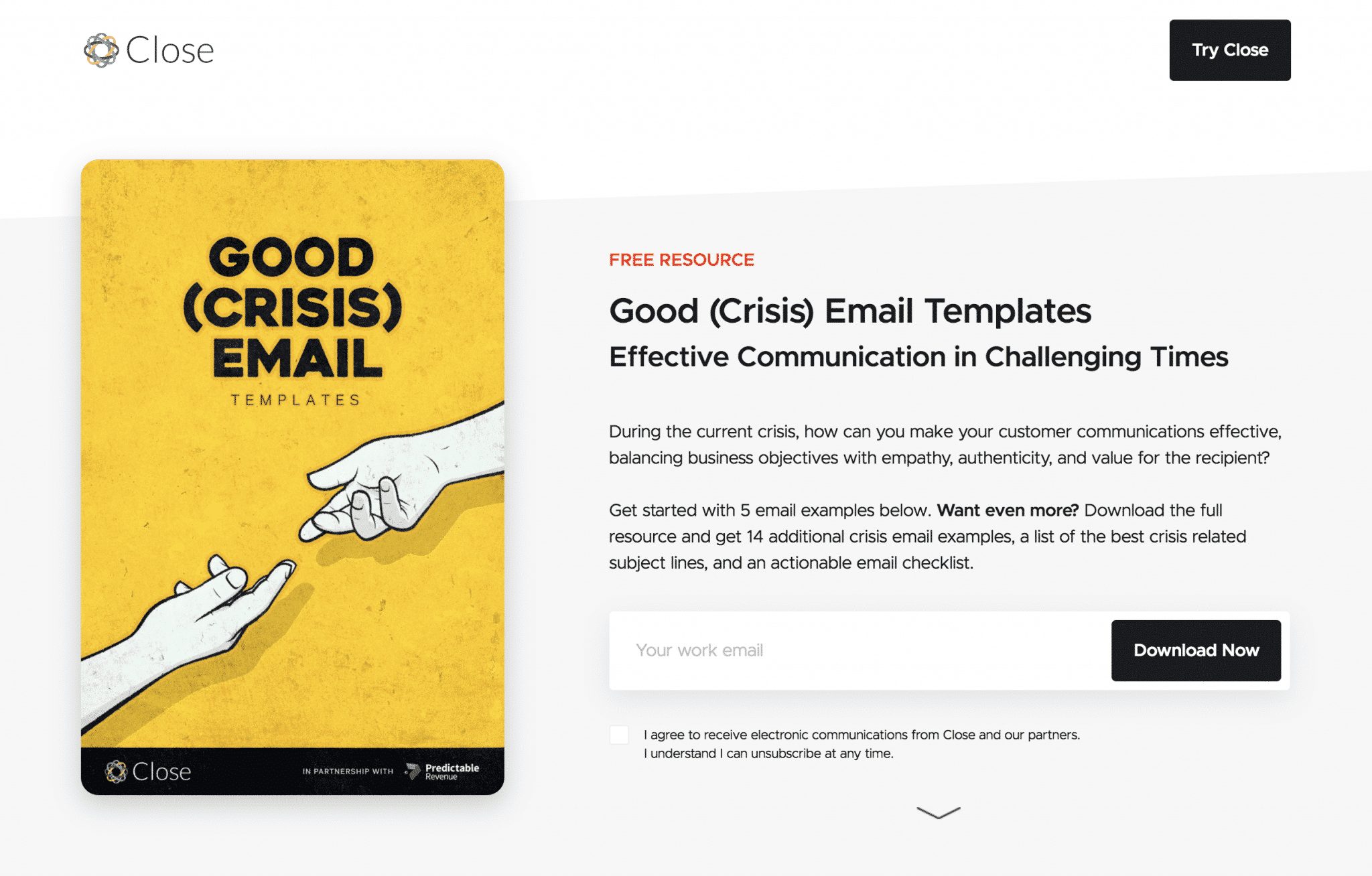
Let’s start with a landing page design example that offers an attractive lead magnet. This landing page from Close, a company that offers a CRM platform for startups and SMBs, deliberately showcases the offer and presents a single email field high up on the page. The page continues with a brief video, and six examples of what the downloadable resource offers, then closes with a free-trial offer. It focuses on getting the visitor to provide an email address to download the template collection offered.
2. IFTTT: Ideal Landing Page for Webinar Registrations
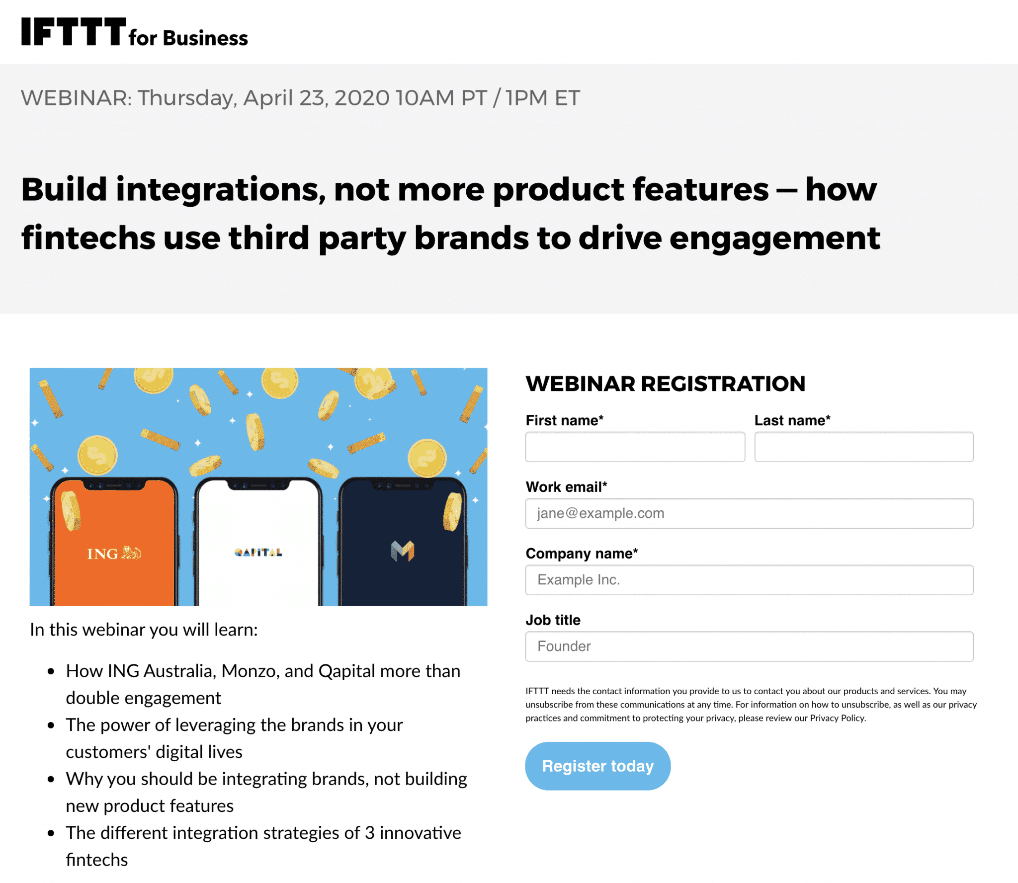
Creating and promoting webinars is a popular and effective way to grow your email list and reach new prospects. I reviewed several landing pages for webinar registration. I chose to share IFTTT’s because, unlike many others, it refrains from including a menu or links leading you elsewhere. The success of this campaign is measured by registrant numbers. The page’s singular focus and CTA — Register today — help achieve this goal.
Another nice touch is the brief, a four-bullet list of what you learn in the webinar. Apply this tip to any content you promote with email capture landing pages.
3. Designli: Uses Actionable Language
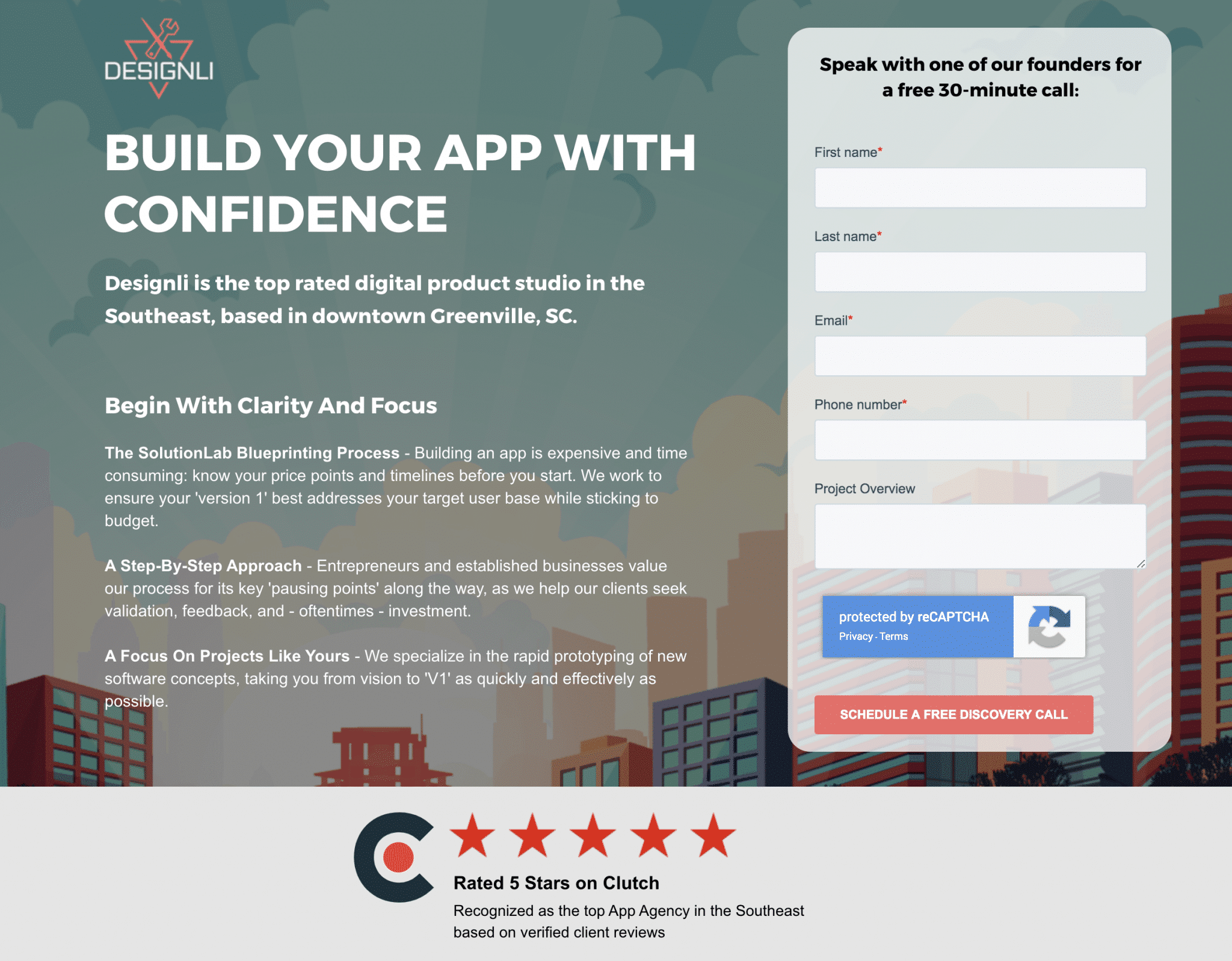
The offer here is simply a consultation call, but kudos to Designli for nailing this email capture landing page with a number of best practices:
- No distractions: Like the IFTTT landing page, this page has no navigation menu or unnecessary links.
- Action-oriented: A strong, action-oriented headline delivers a clear value proposition.
- Simple form: The form is elegantly atop the page, again, with actionable language. It starts Speak with… and ends with a button reading, Schedule a free discovery call.
- Social proof: Before I need to scroll, Designli makes sure I know it has a 5-star rating on Clutch. When I do scroll, I find customer testimonials and an additional button to Request a free call.
4. Stitch Fix: Quiz as a Lead Magnet
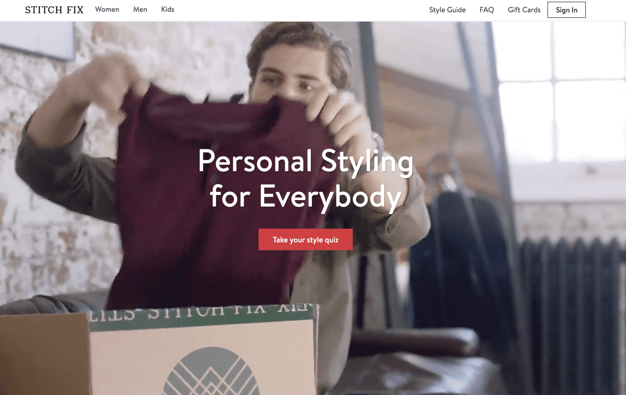
Do you want Stitch Fix to box up and send you clothing that is likely to fit you well and match your tastes? It’s ready to deliver, but only after you Take your style quiz, which, of course, requires submitting an email address.
Yesterday, I purposely gave them only enough information to know I’m a man who dresses casually. Today, I received this email:
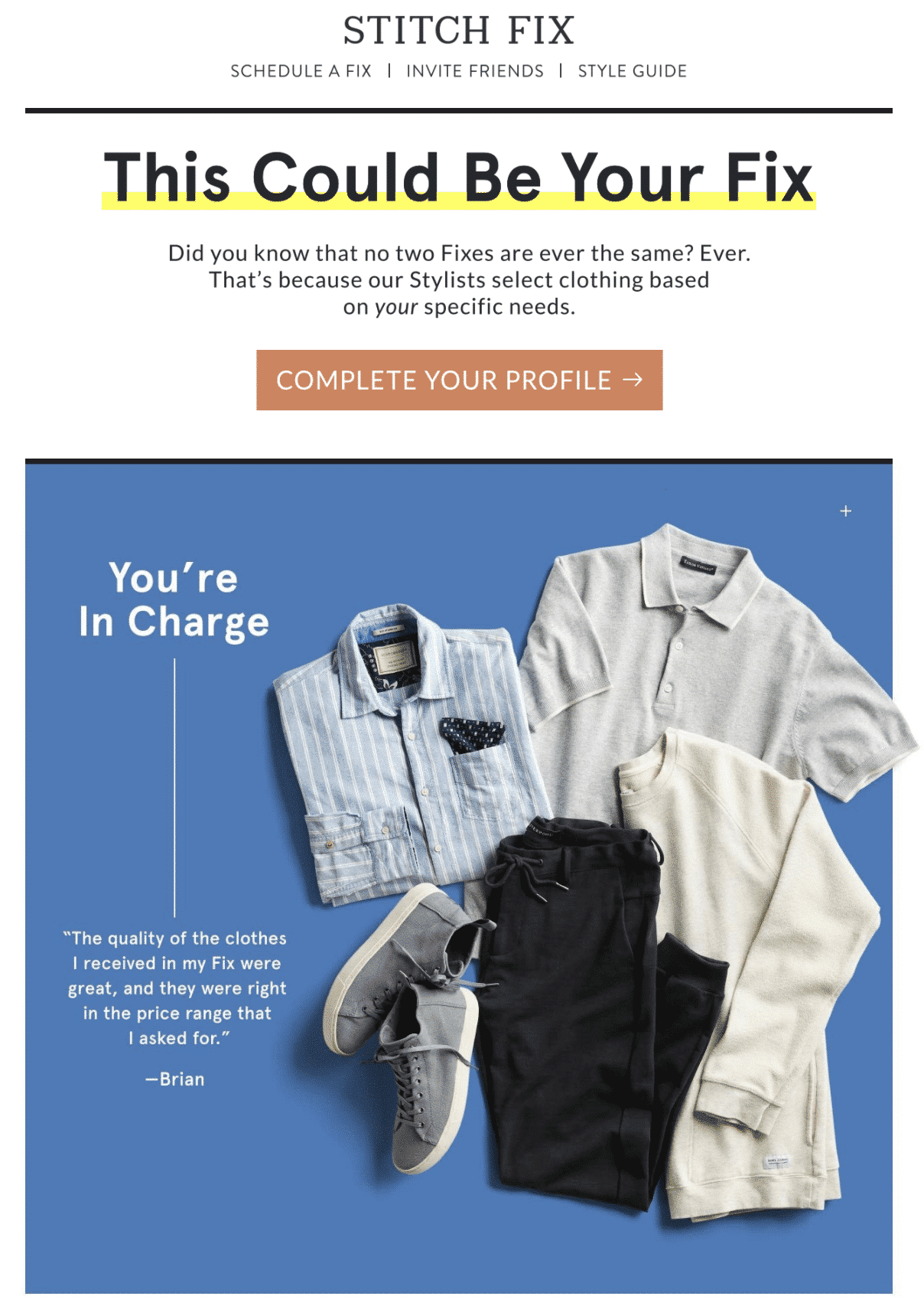
Stitch Fix demonstrates its understanding of lead nurturing here. It personalized my email with the information it has about me and, in a fun and non-pushy way, nudged me to complete my profile.
5. SocialChimp: A Great Way to Create Segmented Lists
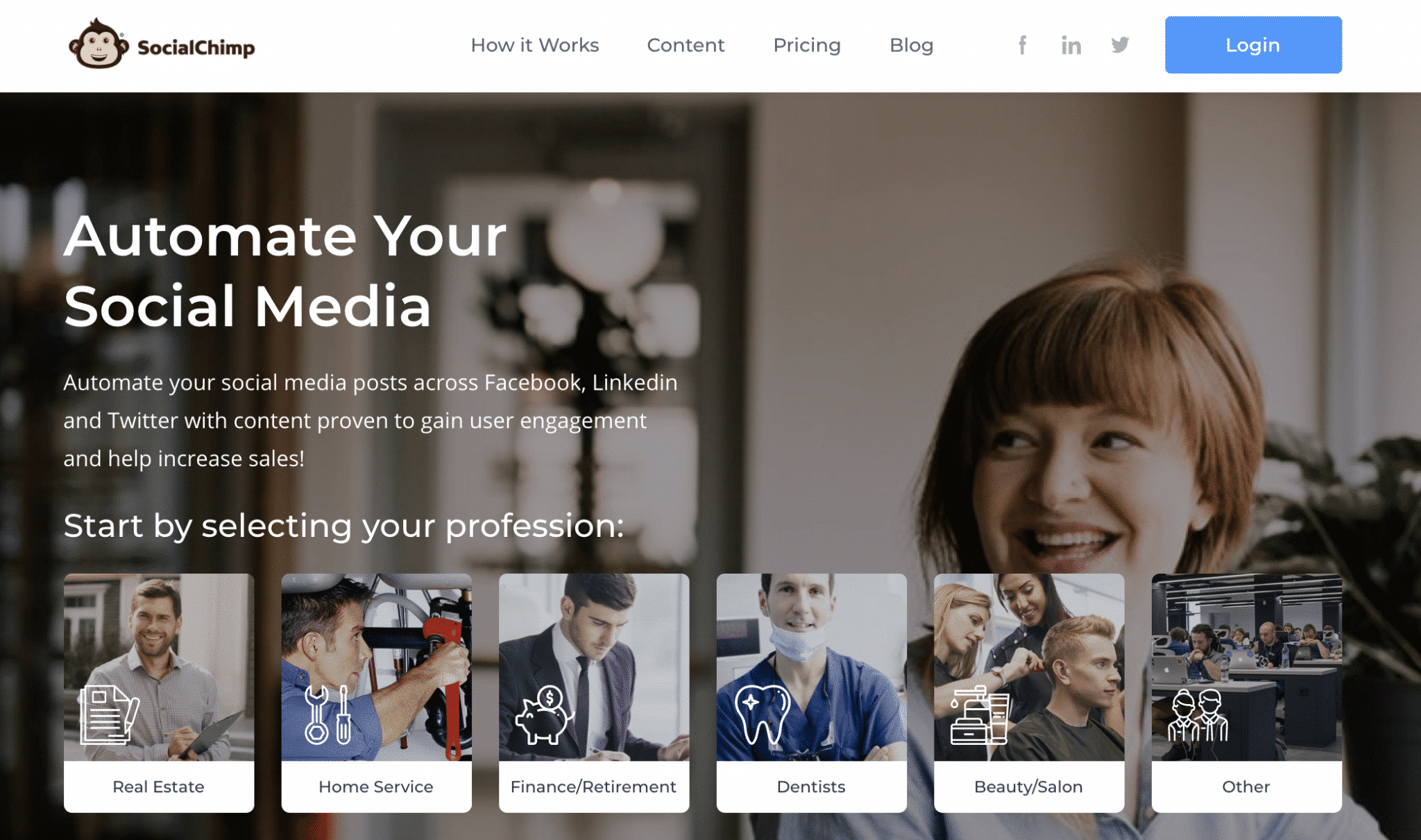
The first thing I like about this SocialChimp landing page is its simple headline that closely matches the ad I clicked. This basic tactic helps assure visitors that they’ve landed on the right page. Learn more about how to write landing page content here.
This landing page also shows a clear attempt to create segmented lists. As you see above, the company’s platform serves six vertical markets. When you click on the button that best pertains to your business, the email-collection process begins and the Professional field populates automatically. It’s fair to assume the lead-nurture process to follow will include industry-specific advice.
6. GoodRx: Simple, Clear Instructions Right on the Landing Page
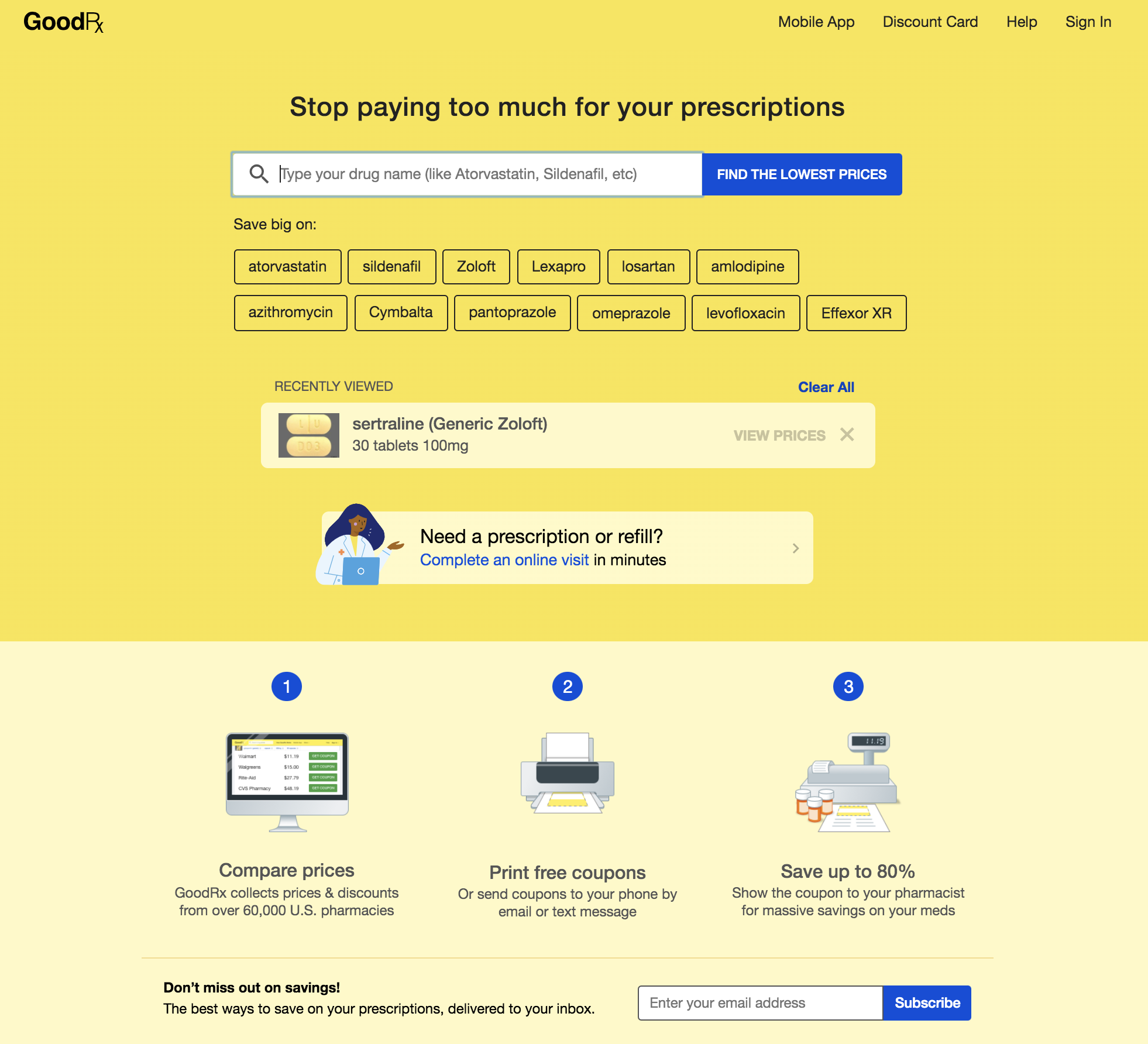
There’s a lot going on in this GoodRx landing page, but the company makes its selling proposition clear from the get-go with a well-written, value-based headline and a simple tool that instantly demonstrates the value of its service. Next, the page provides a quick 1, 2, 3 explanation of how it works and asks for my email address.
The GoodRx landing page covers a number of bases by also offering an explainer video, a free app, a discount card, and a comparison table of sample savings. The page elements, however, are smartly ordered and the bottom line is, well, I’ll show you.…

Learn more about how to design effective landing pages.
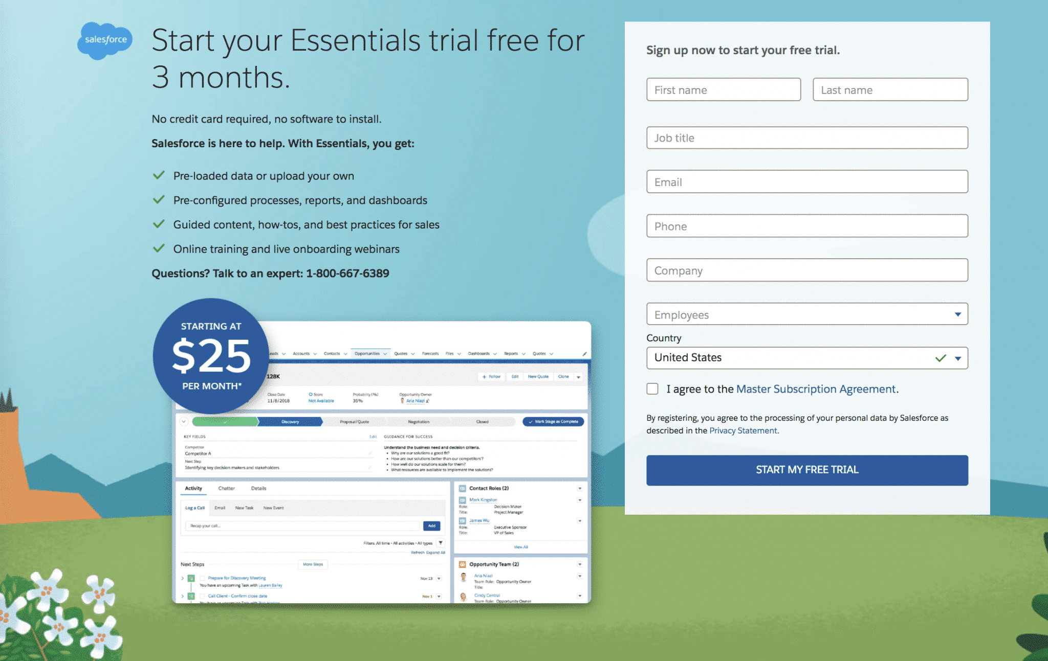
7. Salesforce: Example of a ‘Soft-Sell’ Lead Magnet
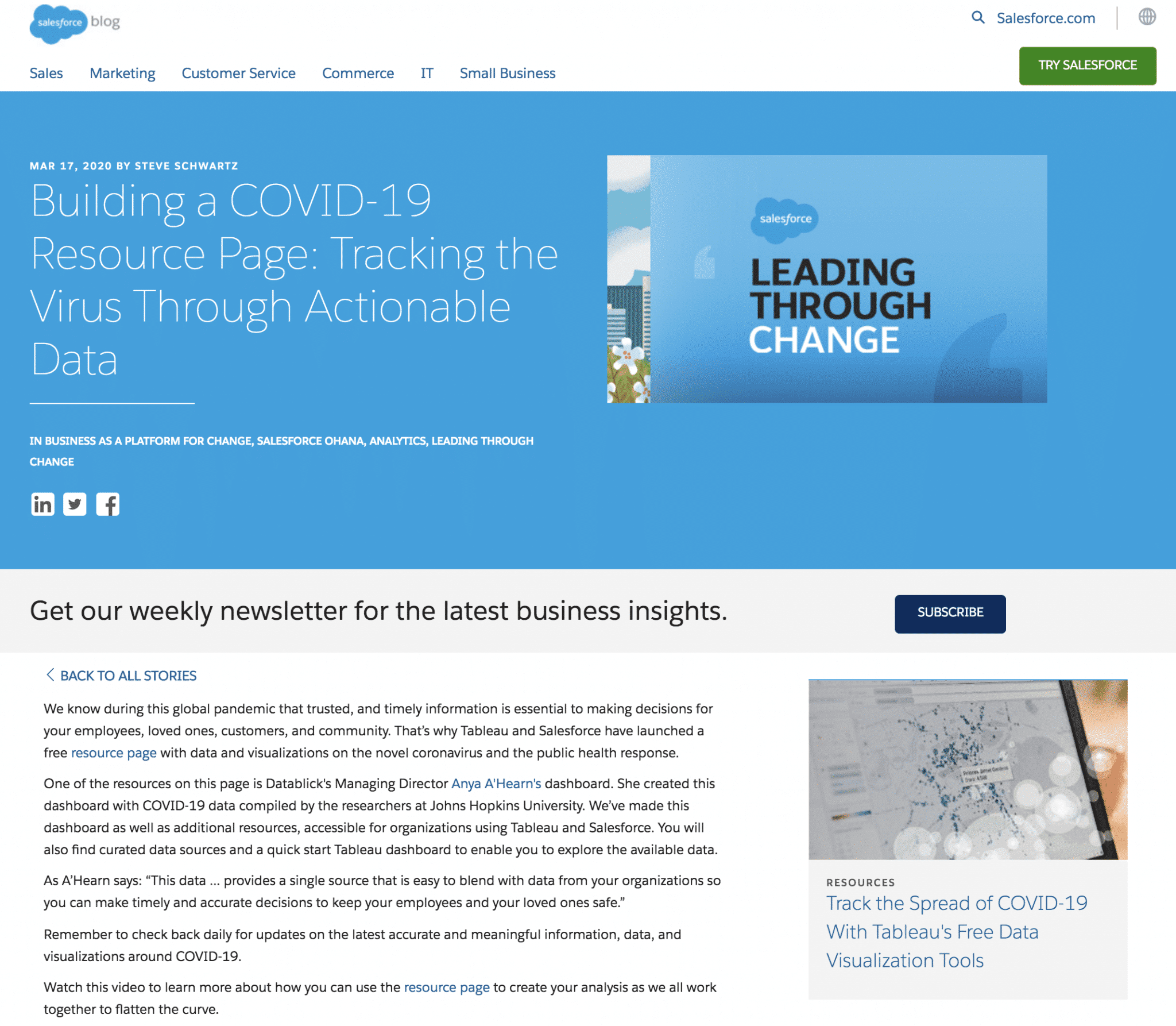
This is interesting. Clicking on Salesforce’s ad leads to a blog post, which probably isn’t the highest conversion tactic the company can offer. My take is that Salesforce recognizes the decision to invest in its software will be a slow and considered one, so positioning the company as a voice of authority is of the utmost importance.
As you see, the landing page offers the option to subscribe to the Salesforce newsletter, a very ‘soft-sell’ lead magnet. If you were to see the entire landing page, which includes a video, news, and related posts, you’d discover the landing page is actually a resource page.
However, atop the page is an offer to Try Salesforce. Clicking the button invokes the following no-nonsense landing page and an extensive free trial of its Essentials platform.
8. Firstleaf: Story-telling as a Selling feature
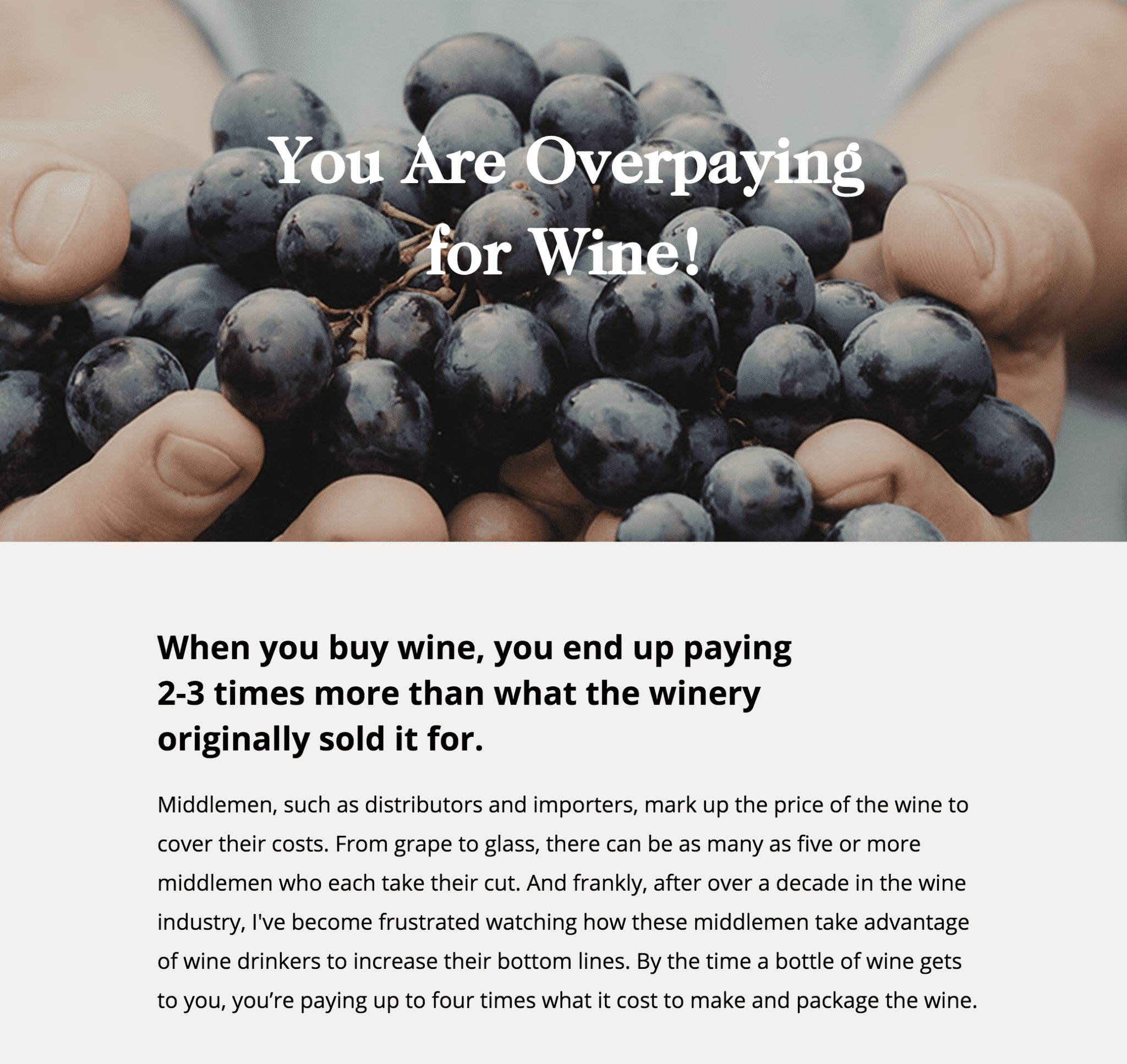
You may recognize this Firstleaf landing page from our post about single-product landing pages. It is a letter from the company’s founder. It tells a brief story about how you can get great wine for less. Its primary CTA is to order your first shipment.
I share this landing page again because it’s also an email capture landing page.
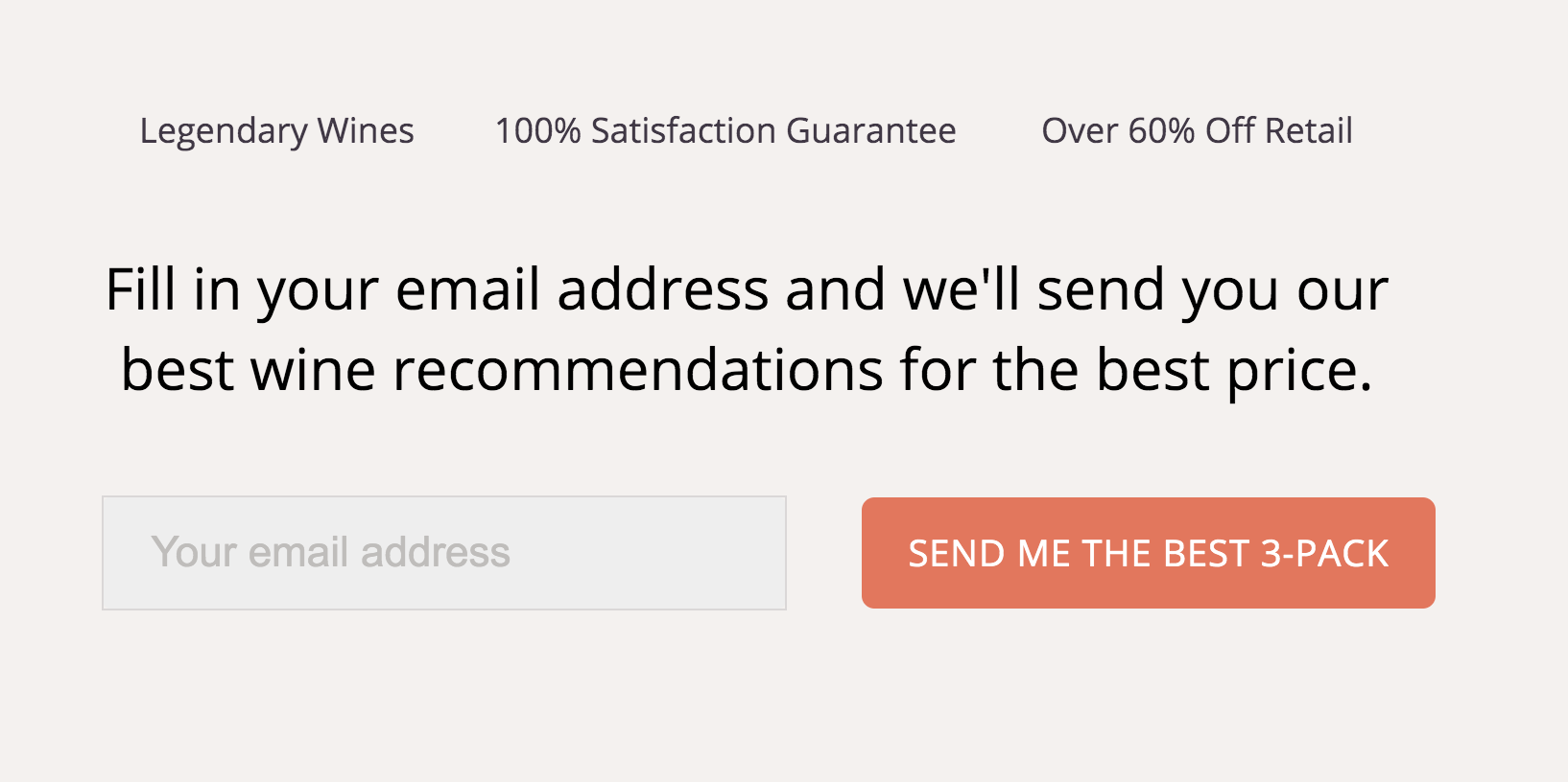
See, near the bottom of the page, a Plan B emerges. Firstleaf recognizes if you’re not ready to order, you may provide your email address to receive the “best wine recommendations for the best price.” Clever. Salesforce’s landing page plan is information first and product second, while Firstleaf’s is the inverse.
9. Lucidchart (A): CTA Entices Readers to Immediately Use the Product
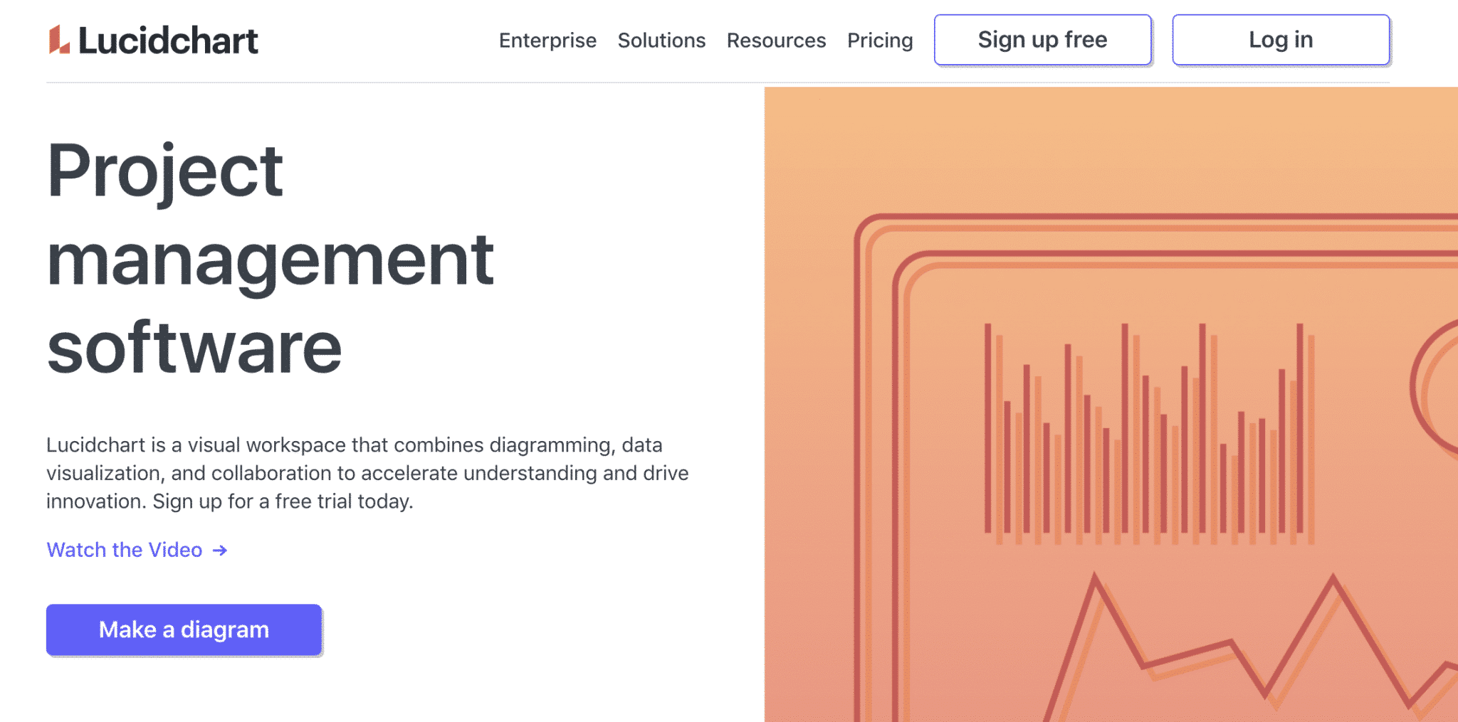
The top of Lucidchart‘s landing page is interesting, not because of its design or headline, but because of its CTA, which reads, Make a diagram.
- First, writing your CTA as a command or directive is effective, especially when it’s this specific.
- Second, the landing page’s prominent Make a Diagram CTA instructs visitors to start with the platform’s most important feature, an ingenious take on a free trial.
- Third, the landing page is a dense (bordering on overkill), homepage-like beast, so it’s wise to aim for conversion right off the bat.
10. Lucidchart (B): Uses A/B Testing to Increase Conversions
Lucidchart, again? Yes, check this out. While clicking around and browsing for email capture landing pages, I saw another Lucidchart ad and clicked out of curiosity.…
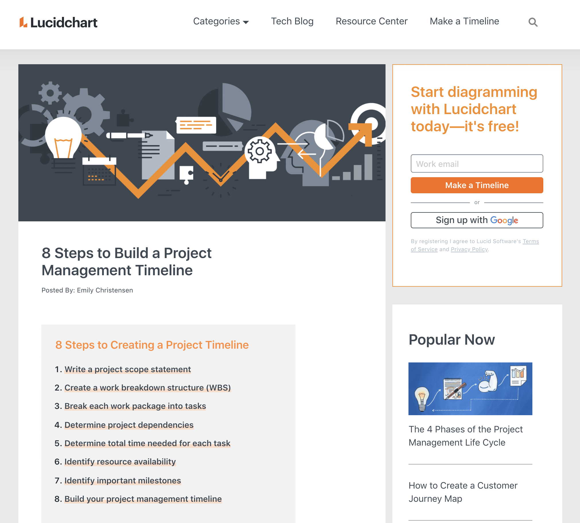
The company is running an entirely different campaign in parallel. This one’s pull is an ‘8 Steps’ guide. Its offer is the same, but it is presented differently.
What we see here is an A/B test. Lucidchart’s two campaigns could produce far different results. If they do, it could kill the loser and run the winner against another variation.
That’s how you optimize your campaigns for conversion — a great final lesson. So, go forth and set up simple and compelling email capture landing pages and convert.
Useful Tips for Creating a Landing Page to Collect Emails
Start With a Compelling Call-to-Action (CTA)
A great landing page CTA doesn’t focus on the product or service being offered, but how it will add value to the reader’s life. For example, let’s say I’m trying to get people to sign up for a weekly newsletter geared to freelance writers. Which CTA are you more likely to respond to: “Subscribe to My Newsletter” or “Get Weekly Tips on How To Land More Freelance Writing Clients.” Also, make sure your CTA button is prominent, clear, and easy to find.
Include a Lead Magnet
One of the best ways to convert website visitors into subscribers is by offering them a lead magnet. A lead magnet could be a free downloadable or discounted product or service offered in exchange for an email address. Lead magnets can be very simple and easy to create. Here are some common examples of effective lead magnets, along with a sample CTA:
- Checklists: Don’t Leave Anything Behind! Grab Our Camping Essentials Checklist!
- Ebooks: Discover Italy — Download Your Free Ebook Today!
- Templates: Work Smarter, Not Harder: Download Your Free Time-Management Template!
- Free courses: Master Your Money With Our Free Online Course: Join Now!
- Discounts: Save Money: Act Now and Receive 25% Off Your Conference Ticket
- Free Trials: Try It Risk Free — Start Your 30-Day Free Trial Now!
With each of these lead magnet ideas, the subscriber is getting something of value in exchange for giving you their email.
Keep it Simple
Avoid clutter on your email capture landing page. This is easier said than done. This isn’t the place to explain every single detail of your product or service. Your goal is to focus on your offer and convince visitors to give you their email.
Here are a few tips to keep in mind:
- Create a responsive landing page: Ensure that your email capture page works seamlessly on all devices, including desktop and mobile. Non-responsive design will hurt your conversion rates.
- Ensure a clean design: The best email capture landing pages follow a minimalist approach. Instead of filling the screen with copy, look for images you can use to help tell your story.
- Write compelling copy: While you don’t want to overwhelm your visitor with text, the copy that you do write needs to sell your visitor on the benefits of responding.
Include Social Proof
Social proof is a psychological phenomenon where people make decisions based on the actions of others. In other words, people tend to follow the crowd when they are feeling unsure about something. You can use this to your advantage by employing social-proof tactics on your landing page. Social proof can include client reviews or testimonials, awards and accolades, sales totals, etc.
We see social proof everywhere. When you notice the tagline “#1 New York Times Bestseller!” on a book cover, that’s social proof. When you see a product on Amazon that has a 4.8-star rating with over 4,000 ratings, that’s social proof.
But what about landing page social proof? One of the best examples is when an email newsletter signup box mentions the thousands of people who have already subscribed:
“Join 10,000 Others: Get Weekly Tips on How to Land More Freelance Writing Clients”
Another example is when a business includes the names and logos of the major brands they have worked with. For example, if an advertising agency mentions on its landing page that past clients include Coca-Cola, Nike, and Disney, it provides instant credibility.
Request Only What You Need
Last but not least, make your email capture forms brief, if possible. A general rule suggests the more field-fills your form requires the fewer responses you get. For example, if you don’t need someone’s first and last name, in addition to their email address, it’s best not to ask for it.
That said, if the aim of your campaign is to nurture leads with communications that speak to specific segments, consider posing optional questions and make it easy to select answers.
Key Takeaways
Email capture is a powerful tool for businesses to build direct connections with their audience, offering a reliable way to nurture leads and drive conversions. By collecting email addresses, companies gain a channel to deliver personalized content, promotions, and updates directly to potential customers, bypassing the noise of social media algorithms.
The best email capture landing pages are simple and focused, with a clear headline, a compelling value proposition, and an easy-to-complete form. Including a strong call-to-action, minimal distractions, and an enticing incentive — such as a discount or free resource — further encourages visitors to share their information and engage with the brand.


