
When running ads, you likely hope to generate leads. That means you need to create landing pages that encourage visitors to take action when they arrive from an ad.
Let’s review best practices for writing and building a high-converting landing page.
How to Optimize Your Landing Pages: 10 Best Practices
1. Your Landing Page Should Only Include One Link
Your landing page should not include the page navigation links typically used on your homepage and throughout your website, nor should it promote your social media accounts. That’s because your landing page shouldn’t include any component that tempts visitors to take any action besides the one you want.
Including superfluous links and other distractions is the most common landing page mistake.
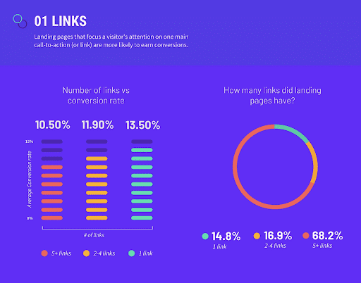
Research from Unbounce reveals that landing pages with one link convert at the highest rate, yet only 14.8% of landing pages have one link. Optimize your landing page by giving visitors only one action to take.
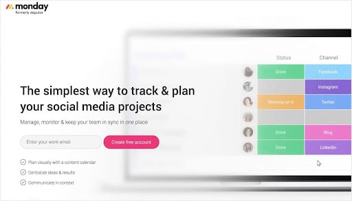
2. Ensure the Ad-to-Page Transition Is Seamless
When a visitor clicks on your ad and is taken to your landing page, it should be clear that they are getting what is promised. Your message should quickly reinforce your ad’s message so your visitor never wonders, “Why am I here?”

Here’s an example of message matching in action. The PPC ad above promises a social media management tool for tracking campaigns. The landing page transitions the visitor to content aligned with the selling proposition.
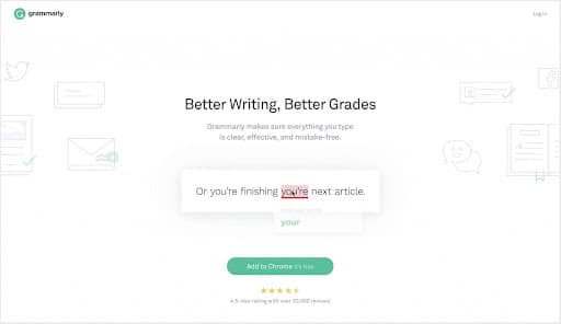
3. Feature a Benefit-Driven Headline
Great landing pages can be short and sweet or long and savory. They vary in length, and there are no steadfast rules to dictate word count. But the headline should include a clear benefit that visitors can relate to.
Here is an example of a Taboola by Grammarly. The headline is clear and straightforward. It explains the benefit the visitor is looking for in a simple manner.
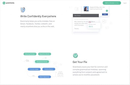
Later, another section provides a subhead benefit. Not only will you see better grades, but you can also write confidently in any setting. Grammarly does a masterful job and clearly stating benefits in a compelling manner.
4. Create a Clear and Simple CTA
Your call to action should be clear and simple. There should be only one action to take. The Grammarly example is also one of creating a simple CTA. Their call to action is to “Add to Chrome.”
The CTA is simple, and Grammarly’s expectations of the visitor are clear. The button is also prominent, and throughout the landing page, it’s easy to take action whenever you’re ready to stop scrolling.
5. Design a Compelling Call to Action
The various landing pages examples in this post feature prominent call-to-action buttons. You want your CTA buttons to stand out on your landing pages. Tactics you can use to direct the reader’s eyes to your button include:
- Use a contrasting color.
- Provide ample negative space around it.
- Repeat the button at multiple scroll depths.
- Create an eye path to the button with arrows or how it’s placed relative to the images used. For instance, photos often show people looking at or pointing to the call to action.
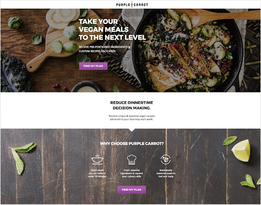
Purple Carrot’s landing page features attractive call-to-action buttons placed in multiple locations.
Here’s how to write a compelling call to action:
- Avoid generic language such as “submit.” Instead, write concise statements that reiterate the offer.
- Try first-person pronouns such as “me” or “mine” and second person such as “you” and “your.” For example, “Find my plan” (as shown above).
- Include action-oriented verbs like “find,” “start,” “get,” and “save.”
- Place statements that might overcome objections near the button, such as “no credit card required” or “cancel anytime.”
For additional ideas and inspiration, check out these articles from Feldman Creative and Thrive Themes.
6. Make Forms Short and Simple
A common — and highly effective — tactic is to request the visitor’s email address and nothing more. Conversion increases vastly when the process is quick and easy.
Resist the temptation to be overly needy or greedy when requiring a user to fill out a form. Unless you have a legitimate reason to qualify the prospect, use the fewest number of fields you can.
Form length may depend on where your offer lies in your marketing funnel. As a rule, longer forms may be less of a deterrent as you progress down the funnel.
Of course, your landing page lead capture form should be neatly arranged and feature clearly discernible fields visitors will find easy to fill. Each field should be clearly labeled and not force the visitor to make decisions.
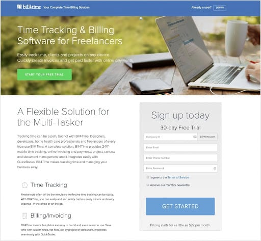
The form above is very simple, with minimal fields. You need to enter an email and phone number and create a password. It’s a simple form that also allows you to see immediate results. The Bill4Time landing page also requires a “Company ID” field because the service requires the new user to create a URL. It also features a button enabling registrants to agree to receive a monthly newsletter, which I suspect will deliver helpful tips for using the service.
7. Use Social Proof
Use social proof to help those unfamiliar with your brand overcome their fears and proceed with greater confidence. Consider including the following elements on your landing pages to elevate the visitor trust:
- Customer testimonials
- Reviews
- Customer logos
- Trust seals (safe transactions, accreditations)
- Media features (“As seen on”)
- Social media posts created by fans and customers
- Privacy policy link
- Numbers (downloads, customer count)
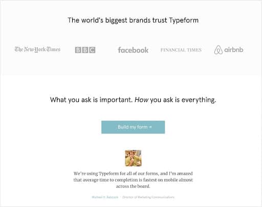
Consecutive sections on this Typeform landing page display customer logos and a testimonial. It makes it clear that Typeform has high social proof because major, trusted brands use it. On top of that, there’s a testimonial from someone who has used the service and finds it helpful.
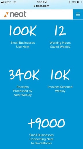
This (mobile) landing page from Neat displays an impressive stack of numbers intended to assure newbies the service has served the needs of thousands of small business customers.
A common and effective tactic on ecommerce landing pages is to showcase user-generated content and review systems that produce star ratings.
8. Use Copywriting Best Practices
It’s easier than ever to create landing pages.
You’ll find landing page templates offered by email service providers (ESPs) and marketing automation platforms.
To get you started, a number of companies provide an even greater selection of templates, plus simple solutions for customizing, re-using and testing them. Look at Unbounce, Instapage, and LeadPages, the leaders in the field, if you’re interested in creating effective landing page designs quickly.
However, you need to make sure you’re using best practices.
Copywriting best practices include things like:
- Research your audience so you understand their needs and pain points, and then write copy that addresses those issues.
- Focus more on benefits than specific features. You need to help the visitor visualize how your offer will enhance their life rather than providing a laundry list of features.
- Speak the language your audience is familiar with and relates to.
- Your CTA should be simple and easy to accomplish. Give the visitor something to do that’s clear-cut.
- Offer the information they need to take the action you suggest.
9. Optimize Pagespeed
Your landing page needs to download quickly. Many visitors get frustrated and give up if a page loads too slowly. Look at the page elements and make sure something isn’t slowing you down. If you keep your landing page simple, it shouldn’t have a lot going on to reduce the pagespeed.
10. Test Your Landing Pages
Don’t forget to test your landing pages. This includes changing aspects of your landing page to compare outcomes. For example, test two different headlines to see which leads to higher conversions. Test out different buttons. This is called A/B testing and can help you see which variant works best.
Put effort into A/B testing your landing pages — it’s worth it. The more you learn about how your specific audience reacts to different landing page designs, the better. When testing your landing pages, make sure you only test one element at a time. You need to know which items are doing well, and testing too many at once can muddy the waters.
Periodically review your landing page and ask the following questions:
- Does your landing page focus on one deliverable?
- Will visitors immediately understand the offer?
- Does every element on the page direct the visitor to comply with the offer?
- Have you removed the navigation links used on your homepage and throughout your website?
- Does your headline closely match the content of the ad or asset that inspired the visit?
- Have you made your call to action button (or buttons) impossible to miss?
- Does your call to action reiterate the offer and imply action?
- Is your form fast and easy to complete?
- Have you included one or more forms of social proof on the page to build trust?
Test each of these elements and tweak them. As you continually improve, you’ll start to see better conversions.
See How Gannett’s Innovative Headline Testing Benefits Local Audiences
See How A/B Headline Tests Boost Homepage Article CTR by 44% for German Sports Publisher
Landing Page Benchmarks
Before you start planning your landing page optimization strategy, it’s important to look at landing page conversion statistics. When you know the benchmarks, you can understand whether your landing pages are underperforming or exceeding expectations; and you’ll know which landing page best practices work for your audience.
Landing Page Conversion Benchmarks
Here are some general benchmarks for landing pages to get you started:
- The average conversion rate for landing pages is 9.7% (Unbounce)
- 90% of visitors who read your headline will also read your call-to-action (CTA) (TechJury/MarketingSherpa)
- Companies that increase their number of landing pages from 10 to 15 see a 55% increase in leads (Hubspot)
- 48% of landing pages include more than one offer (Marketing Experiments)
- Companies with 31 to 40 landing pages get seven times more leads than those with one to five landing pages (Hubspot)
- Landing pages have, on average, 11 form fields (PageWiz)
- Companies with more than 40 landing pages get 12 times more leads than those with 15 landing pages (Hubspot)
- 86% of the top landing pages are mobile-optimized (Nifty Marketing)
- 48% of marketers build a new landing page for each new campaign (Marketing Experiments)
- 52% of marketers reuse landing pages for their campaigns (Marketing Experiments)
Landing Page Conversion Rate Optimization (CRO) Statistics
The following landing page conversion rate statistics will fuel ideas for your landing pages:
- Reducing landing page form fields to just four, boosts conversions by 120% (Unbounce)
- Requesting age reduces conversion rates (Hubspot)
- Putting multiple offers on your landing page can reduce conversions by 266% (TechJury/bluleadz)
- Conversion rates drop by 4.42% for every extra second of page-load time (Portent)
- Landing page sign-up forms have a 23% conversion rate (Omnisend)
- 25% of online shoppers land on product-detail pages (Marketing Charts)
- Visitors who land on product-detail pages generate half the revenue of those landing on other pages (Marketing Charts)
Landing Page Optimization Statistics
These landing page stats should give you a head start on landing page optimization:
- Click-through landing pages perform best for most industries, but 62.6% of landing pages use forms (Unbounce)
- A one-second delay in page-load speed leads to a 7% drop in conversions (Neil Patel)
- A typical landing page bounce rate benchmark is 60-90% (comedialabs)
- A mobile page load time of over five seconds almost doubles the likelihood of visitors bouncing (Google)
- 80% of a mobile visitor’s attention concentrates on the top of the page (OptinMonster)
- 37% of the top landing pages include testimonials (Nifty Marketing)
Landing Page Click-Through Rate Statistics
What happens when visitors click? Check out these landing page conversion statistics, including some from Taboola Trends:
- Images of people have a 66% higher click-through rate (CTR) than those of objects (Taboola Trends)
- The CTR for images without text is 52% higher than for images with text (Taboola Trends)
- Close up images are 24% more engaging than zoomed out images (Taboola Trends)
- Color videos have a 36% higher completion time than black and white videos (Taboola Trends)
- Navigation links reduce post-click landing page conversions (Instapage)
- Using click-to-scroll reduces bounce rate by 37% (OptinMonster)
Landing Page Best Practices
These landing page conversion stats and landing page best practices should prove invaluable when it comes to developing your own landing page strategy:
- 82% of customers read online reviews and these help to build trust (BrightLocal)
- Using color boosts brand recognition and sales by up to 80% (Xerox)
- Including contact information builds trust (Neil Patel)
- Long landing pages can generate 220% more leads (Marketing Experiments)
- Images of real people perform better than stock images (Content Marketing Institute)
- 37% of the best landing pages include testimonials (Nifty)
- Using landing page videos can boost conversions by 86% (TechJury)
- 58% of landing pages include clickable graphics (Marketing Experiments)
- Personalized CTAs convert 202% better than generic CTAs (Hubspot)
Landing Page A/B Testing Statistics
Testing is key to identifying landing page conversion rate benchmarks and improving performance. Here are some eye-opening landing page conversion rate statistics relating to landing-page tests:
- Just 17% of marketers use A/B testing to boost conversion rates (Hubspot)
- President Obama used A/B testing to raise an additional $60 million (Event360)
- A/B testing is the most common method for optimizing landing pages and improving conversions (Econsultancy)
- More than 20% of businesses say they don’t have an effective testing strategy (Business2Community)
- Companies who saw improved conversion rates in the past year are doing, on average, 50% more tests (Econsultancy)
- Companies that use Conversion Rate Optimization (CRO) tools see a 223% boost in ROI (VentureBeat)
- Targeting and testing can increase conversions threefold (Steelhouse)
- 44% of companies use split-testing tools (Invesp)
- 61% of companies run five or fewer landing-page tests per month (Wordstream)
Landing pages are a common business tool, but not everyone uses them effectively. Use the landing page conversion statistics and landing page benchmarks in this guide to help you understand what’s working and what’s not working with your landing pages, so you can meet your business goals.
Key Takeaways
A high-converting landing page is the key to success for your ad campaigns. Your landing page is the best way for you to convert visitors to leads that can be nurtured to make a sale.
Frequently Asked Questions (FAQs)
What makes a good landing page?
Good landing pages have various key components, including a strong headline, clear messaging, simple call to action and compelling copy that encourages the visitor to take the desired action. The landing page should also have a simple form or action that makes it easy to take the desired action.
What is the best layout for a landing page?
A simple layout that is clean and minimalist, with a compelling headline and visible call-to-action button, is more likely to be high-converting.
Should I design a custom landing page or use a template?
Whether you use a template or a custom page depends on your goals. However, many templates can be useful in helping you make sure the basic elements of a high-converting landing page are present.


